Single Report
Reports provide you with the ability to view your data from different angles and thus capture all aspects that influence your process, show new trends or depict your current business state.
Each Report consists of the edit mode and the view mode to perform different kinds of actions on it.
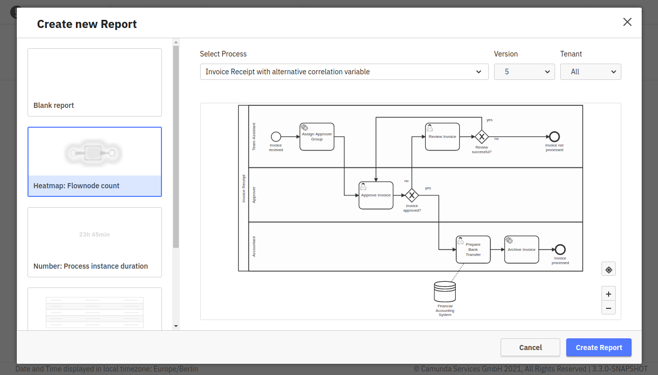
To create a new process Report, click the “Create New” button on the Homepage or Collection page and select the “New Report - Process Report” option. This opens a dialog where you can set the Report name, which process to create the Report for and select one of multiple Report templates. You can later change all these settings in the Report edit mode.
Edit Mode
The edit mode allows you to configure the Report and adjust it to your needs. The following operations are possible within edit mode:
- rename your Report
- build a Report
- configure your Report
- save the current state with your applied changes
- cancel changes you already applied to the Report
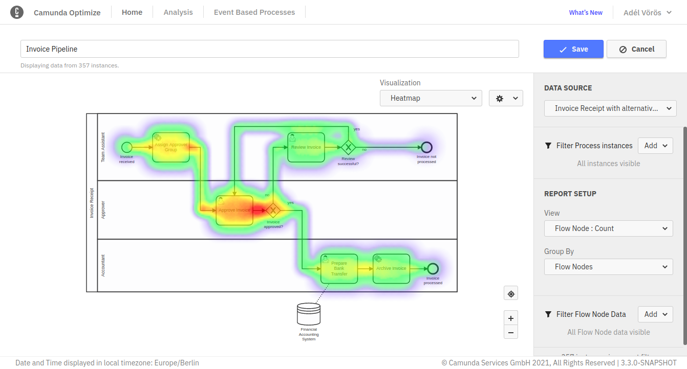
Building a Report is the crux of the Report edit mode. The building process itself is composed of several steps, which happen in the control panel.
Select a Process Definition
Every Report relates to a specific process definition, version(s) and tenant(s). You always need to choose a process definition you want to create a Report for. Open the process definition popover to select a definition for your report. Independent from all other configuration options you can always adjust the process definition. If there are a lot of process definitions, you can use the input field to search for the definition you are looking for.
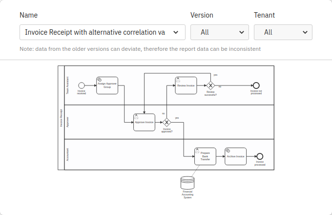
After selecting a process definition, you can select a specific version or version range. Using the version dropdown, you can choose between all versions, the latest version or a specific set of versions.
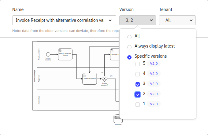
If you select the “All” option, every process instance across all versions of the process definition will be considered in your Report. Using the “Always display latest” option makes your Report always refer to the latest version. Keep in mind that if a new version of the process is deployed, the Report will automatically consider process instances of this new version only. By using the “Specific version” option you can specify one or multiple existing versions of the process.
Data from older versions is mapped to the most recent version in the selection. Therefore, the Report data can seem to be inconsistent, which is due to changes that occurred within the diagram through the different versions, e.g. the old versions do not contain newly added tasks or a part of the diagram was removed because it was considered to be obsolete.
If you are running a multi-tenancy setup there is an additional tenant selection component for processes that can have more than one tenant. This allows you to specify which tenants’ data is included in the Report.
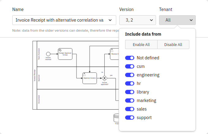
By default, all process instances for the selected process definition are included in a Report. You can reduce this set of process instances by applying a Filter. Read more about Filters in the Filter section.
Define the Report
In this section of the Report builder you are characterizing the output of the Report. Basically, you are defining “I want to view … grouped by … visualized as …”. To understand better what “view” and “group by” mean, you can use the analogy of a graph, where “view” is the y-axis and “group by” is the x-axis. First, you need to select which part of the data you want to view. Optimize offers the following view options:
- Raw Data: View just a table with the actual data listed as rows. This can come in handy if you found interesting insights in certain process instances and need detailed information about those instances or you are exploring a process definition with a limited number of instances.
- Process Instance
- Count: View how many process instances were executed.
- Duration: View how long the process instances took to complete.
- Incident
- Count: View how many incidents occurred on the process.
- Resolution Duration: View how long the incident took to get resolved.
- Flow Node
- Count: View how often the flow nodes (e.g. tasks) have been executed.
- Duration: View how long each flow node took to complete.
- User Task
- Count: View how often each user task has been executed.
- Duration: View how long each user task took to complete.
- Variable: View an aggregation of values for a specific numeric variable of the process definition.
For duration and variable views there is the possibility to select between different aggregation types.
Subsequently, you need to define how to group the data. Think of it as applying a metric to your input, where you break up the data by date, flow nodes, variable values or other properties. For that, you have different options:
- None: Do not split up the data.
- Flow Nodes: Cluster the data by flow nodes.
- User Tasks: Cluster the data by user tasks.
- Duration: Cluster the data by duration. Depending on the selected view, this can be the duration of process instances, flow nodes or user tasks.
- Start Date: Group instances together that were started during the same date period or time, e.g. hour, day or month. Depending on the selected view, this can be the start date of process instances, flow nodes or user tasks.
- End Date: Group instances together that were finished during the same date period or time, e.g. hour, day or month. Depending on the selected view, this can be the start date of process instances, flow nodes or user tasks.
- Running Date of the Process Instance: Group process instances together that were running during the same date period or time, e.g. hour, day or month.
- Variable: Process instances with the same value for the selected variable are grouped together.
- Assignee: Only available for User Task views. Tasks with the same Assignee are grouped together.
- Candidate Group: Only available for User Task views. Tasks with the same Candidate Group are grouped together.
Finally, you just need to define how you want the data to be visualized. Examples are heatmap, table, bar or line chart.
Not all of the above view, group by and visualization options can be combined. For instance, if you choose Flow Node: Count as view, the data is automatically grouped by Flow Nodes as no other combination would be valid. All possible combinations can also be found in the following table:
| View | Group By | Visualize as |
| Raw Data | None | Table |
| Process Instance: Count, Process Instance: Duration | None | Number |
| Process Instance: Count | Start Date, End Date, Running Date, Variable, Duration | Table, Chart |
| Process Instance: Duration | Start Date, End Date, Variable | Table, Chart |
| Incident: Count, Incident Duration | None | Number |
| Incident: Count, Incident Duration | Flow Nodes | Table, Chart, Heatmap |
| Flow Node: Count, Flow Node: Duration | Flow Nodes | Table, Chart, Heatmap |
| Flow Node: Count | Start Date, End Date, Duration, Variable | Table, Chart |
| Flow Node: Duration | Start Date, End Date, Variable | Table, Chart |
| User Task: Count, User Task: Duration | User Tasks | Table, Chart, Heatmap |
| User Task: Count, User Task: Duration | Start Date, End Date, Assignee, Candidate Group | Table, Chart |
| User Task: Count | Duration | Table, Chart |
| Variable | None | Number |
Heads Up!
Please note that you might sometimes see a warning message indicating that the data is limited to a certain number of points. This happens because the available stored data, in this case, is very large and it is not possible to display all the data in the selected visualization.
Target Value Comparison
Based on flow node duration heatmaps, Optimize allows you to specify a target value for every activity. For example, if a user task has to be completed within one day, you can set the target value to one day. If the time it takes to complete the user task exceeds this target value, the task is highlighted in the heatmap.
To set target values and create a target value comparison heatmap, you need to be in the edit mode of a Report which has the following configuration:
| View | Flow Node Duration/User Task Duration |
| Group by | Flow Nodes/User Tasks |
| Visualize as | Heatmap |
If your Report has this configuration, a target value button is visible. Clicking on the Target Value button for the first time opens an overlay containing the process diagram and a table with all flow nodes. You can also see the actual duration value for every flow node. If you want to set a target value for a flow node, use the number and unit fields in the last column. If the target value number field for a flow node is empty, this flow node has no target value set (the selected time unit is ignored in that case).
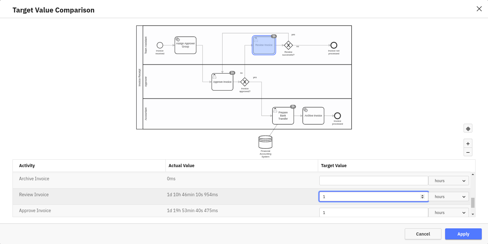
If you set a target value for a flow node, this target value is represented as a badge on the flow node in the diagram in the upper part of the overlay. You can click on any flow node in the diagram to jump to the target value input field in the table. If you have a user task Report, you can only select user tasks here, as only those are included in the Report result. When selecting a target value input field in the table, the corresponding diagram element is highlighted. To save the target value configuration, click the Apply button.
After you save the target values the normal duration heatmap is replaced with a target value visualization. In this new visualization, flow nodes with an average duration larger than the specified target value are highlighted in red.
If you mouse over one of the nodes the tooltip shows the following:
- The target duration value
- The actual duration
- The relative percentage the actual value is of the target value
- A button to download a list of process instance IDs that exceed the target value
You can also see the target value as a badge on the diagram.
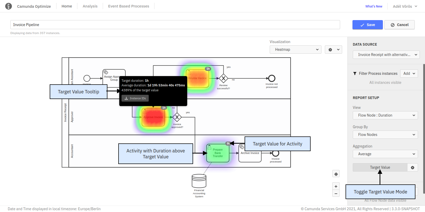
After the initial target values for a Report are set, you can use the Target Value button to toggle between the Target Value and the regular Duration view mode. If you want to change target values, you can use the gear button to open the overlay again.
As with any change to a Report configuration, in order to persist target values and show them in the Report view mode and on Dashboards, you need to save the Report using the Save button in the upper right corner.
Process Instance Parts
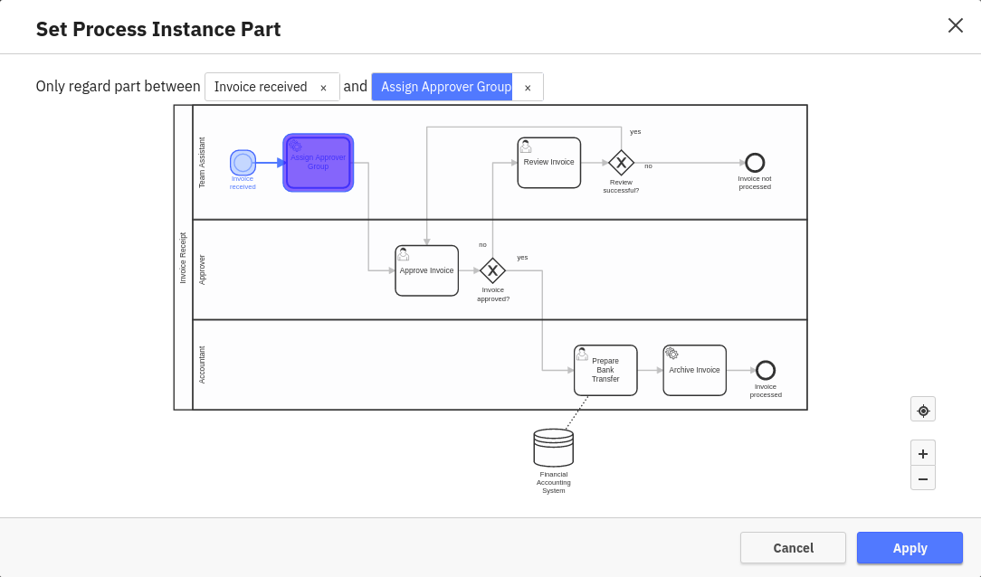
In some cases you are not interested in the duration of the whole process instance, but only a certain part of it. For that scenario, there is an additional button called “Process Instance Part” available for every Process Instance Duration view. Clicking this button opens an overlay letting you select the start and end of the part of the process instance you are interested in. After confirming the selection, the displayed duration refers to the selected part only instead of the whole instance.
In some cases it can happen that the same activity is executed multiple times in the same process instance, e.g. if the process contains loops or parallel gateways. In such cases, Optimize considers only the part between the start date of the first instance of the start node and the end date of the first instance of the end node.
Configure a Report
The configuration panel groups all the settings that can be applied to a Report in one place. To see the panel click on the cog button available in the edit mode of any Report. Every visualization has different settings that can be configured in the panel.
When you save changes to the Report configuration they apply to the Report view mode and any Dashboard this Report is displayed on.
Number
Number Reports are any Reports that are visualized as a single number (e.g. Process Instance: Count grouped by None or Process Instance: Duration Grouped by None).
In number Reports, the following configurations are possible:
Number Precision
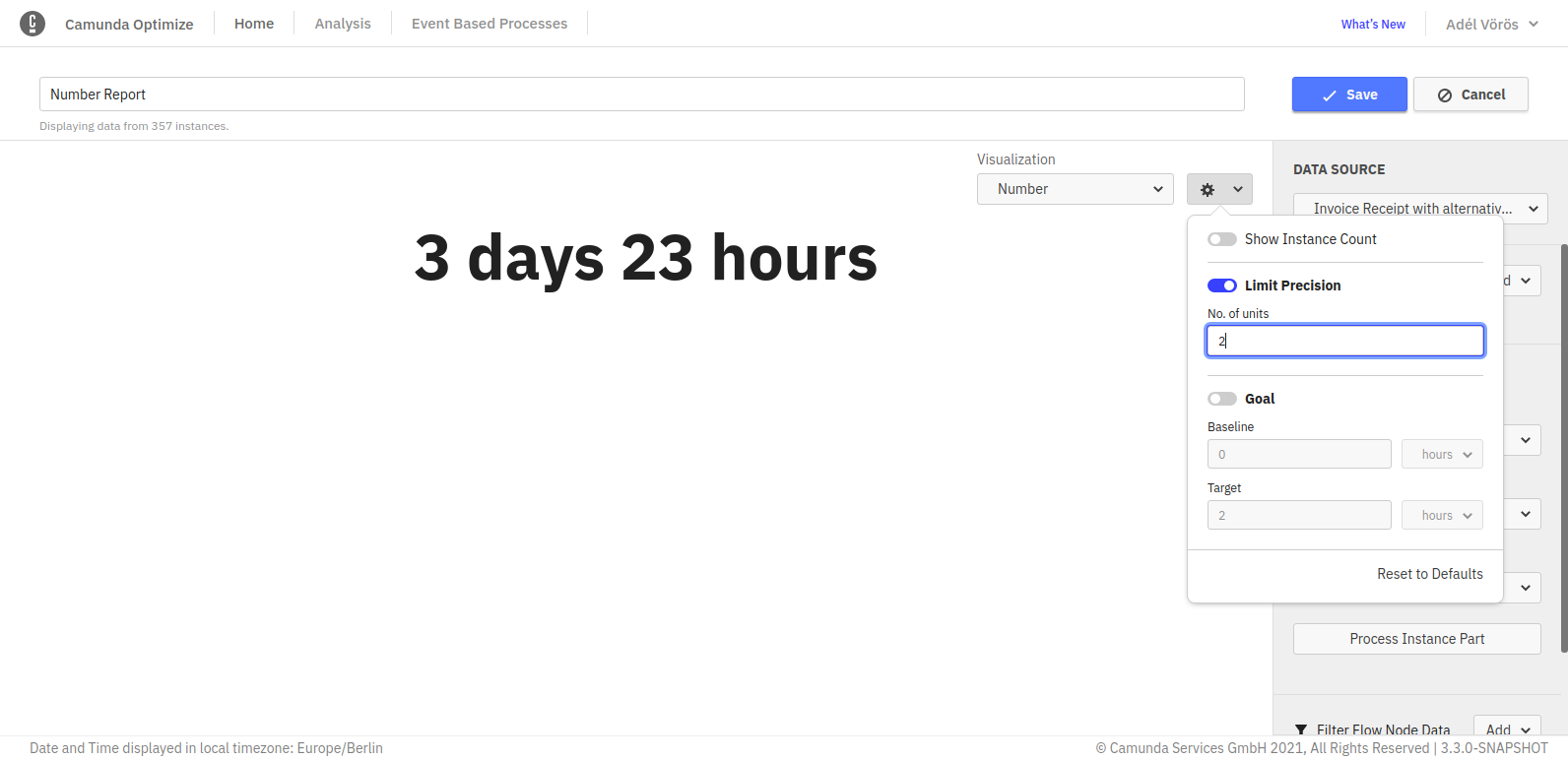
Number precision can be configured from the panel to limit the most significant units to be shown.
For example, we have a Report that calculates the total process instances duration. When the precision limit is not set, you will see all possible units, e.g.: 1y 5m 2wk 5d 3h 16min 3s 170ms. In case you are only interested in certain units - e.g. months - you can omit all insignificant units by limiting the precision as shown in the figure below:
Number Goal Value (Progress bar)
Number Reports appear as progress bar when the goal option is enabled from the panel as shown. The baseline and the target value of the progress bar can be also set using the panel.

You can toggle between the progress bar and the single number visualization using the same goal line switch.
A red line indicator appears on the progress bar when its value exceeds the goal value. On the right-hand side of the indicator, the bar turns into a darker color to clearly show the exceeded amount.

Duration and Variable Report Aggregation
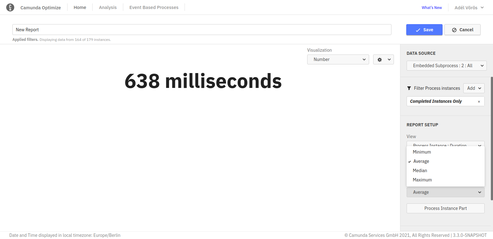
For duration and variable views the default aggregation type is the average. In order to change that, you can select between different aggregations like minimum, maximum and median in the Report configuration panel. Please note that the median is an estimate and the other operations are exact values.
User Task Duration Time
In User Task duration Reports, you have the opportunity to select which part of the user task’s lifecycle you want to see in the Report:
- Idle: View how long each user task was considered idle (Not claimed by an assignee/user) during its execution.
- Work: View how long each user task was considered to be worked on by assignees/users (time of first claim until it was finished) during its execution.
- Total: View how long each user task took to complete.
Table settings
In Table Reports, the following configurations are possible:
Show instance count
Displays the total instance count on the right-hand side of the visualization. If you save the Report while this option is enabled, the number will also be shown on any Dashboard this Report is added to and when the Report is shared.
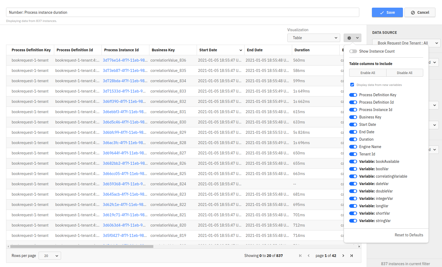
Hide, show and reorder table columns
The table settings allow you to hide specific columns using the configuration menu as shown in the figure below:
When working with raw data table Reports, you can also re-order the table columns using drag-and-drop on the header of the respective column.
Sorting by table column
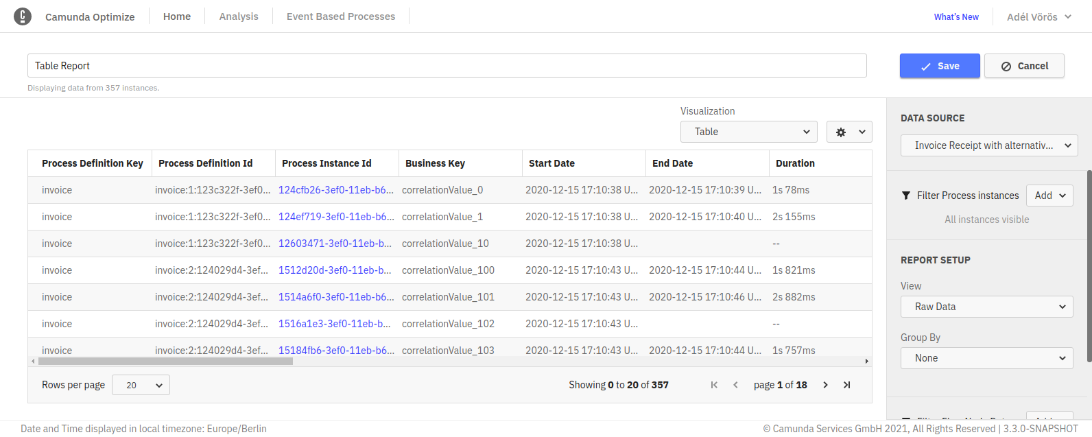
To sort a table by a specific column, simply click on the header of that column. Doing that will show a small caret icon in the header of the column indicating which column the table is currently sorted by and the direction of this sorting (ascending or descending) as shown:
Clicking again on the same column header will reverse the direction of sorting.
Saving the Reports will also preserve the applied sorting.
The sorting currently works for all table Reports except for:
- Combined table Reports
- Reports grouped by integer type variables
Absolute and Relative Values
When configuring a count Report, you have the opportunity to configure which columns are included in the table. Using the switches for absolute and relative value you can hide or show the corresponding columns.
Custom Bucket Size for Date Variables
When evaluating a Report which is grouped by a date variable and displayed as a table, Optimize offers you the option to select your preferred unit specifying the custom result bucket size from the Report configuration menu. The avaiblable units are year, month, week, day and automatic. The default unit is automatic, which will create evenly spaced result buckets based on the values of the date variable. This configuration option is also available for charts.
Custom Bucket Size and Baseline
When evaluating a Report which is grouped by duration or a number variable, Optimize offers you the option to specify your preferred result bucket size as well as a custom baseline in the Report configuration menu. The bucket size determines the width of one bucket, and the baseline specifies the start of the first bucket.
For example, say a Report contains the variable values 0.3, 6 and 13 and you set a bucket size of 5. By default, Optimize would now return a bucket for the values 0.3 to 5.3, one for 5.3 to 10.3 and one for 10.3 to 15.3. You may prefer your bucket start and end points to be a round number, in which case you should set your baseline to 0. With a baseline of 0 and bucket size 5, the result buckets now span 0 to 5, 5 to 10 and 10 to 15.
If these configuration fields are not set, Optimize will by default create evenly spaced result buckets with a range based on the minimum and maximum values of the number variable.
This configuration option is also available for charts.
Charts (Line, Bar, Pie)
In bar chart and line chart Reports, it is possible to select the color of the graph, add names to the x-axis and y-axis, and edit many other settings as shown in the figure below:
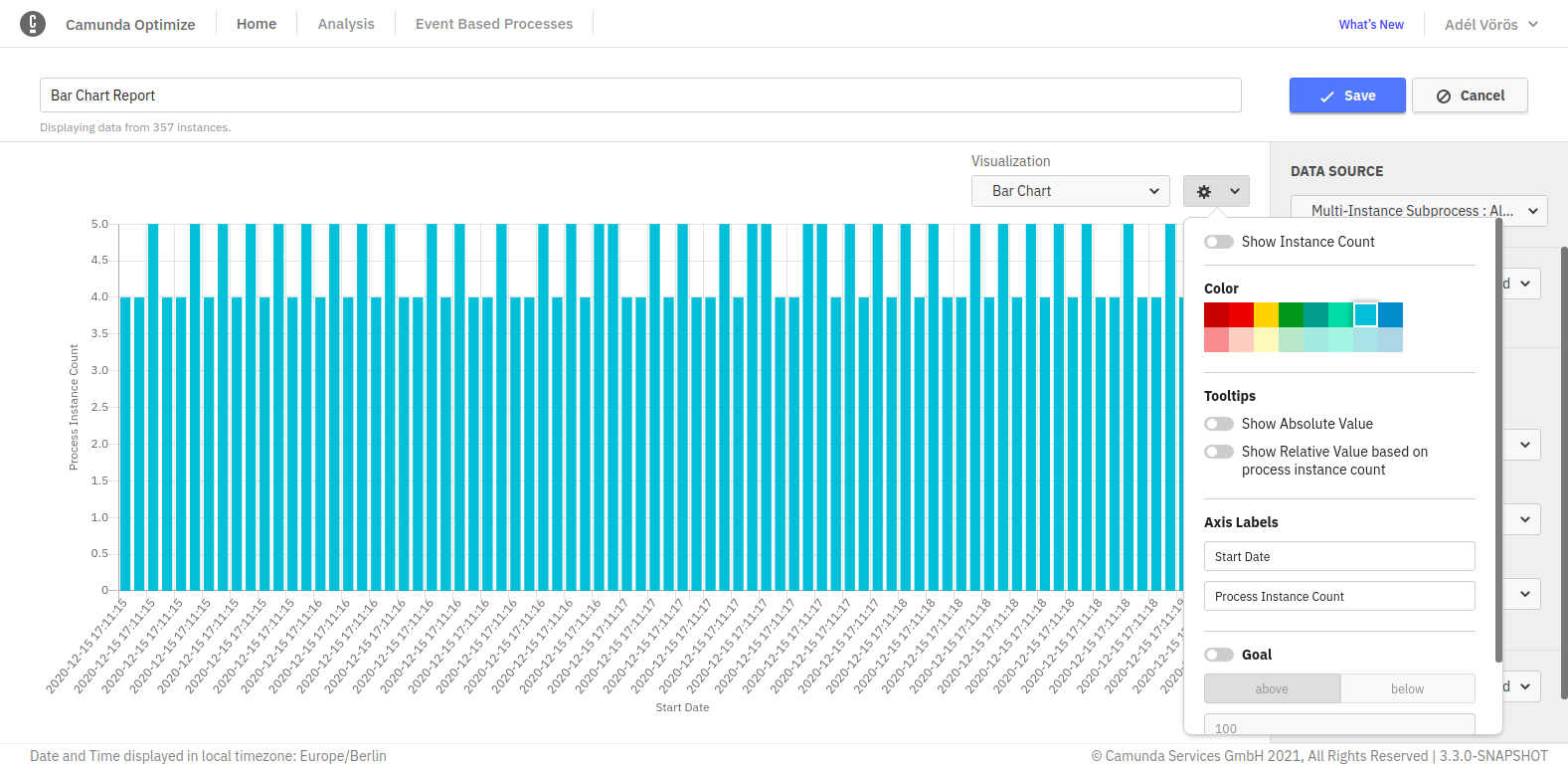
In charts, you can hide/show absolute and relative values that appear in the tooltips.
Show instance count
Displays the total instance count on the right-hand side of the visualization. If you save the Report while this option is enabled, the number will also be shown on any Dashboard this Report is added to and when the Report is shared.
Chart Goal Line
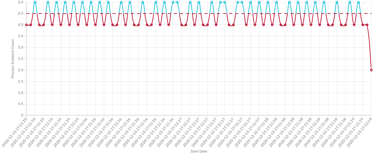
Optimize allows you to set a goal line in bar chart and line chart visualizations. Using this feature, it is possible to highlight anything above or below a certain value.
A good use case for such functionality is the following example:
First, go to the edit mode of a Report and choose the following configuration:
| View | Count Frequency of Process Instance |
| Group by | Start Date of Process Instance: Month |
| Visualize as | Barchart |
Let us say that the number of completed process instances should always be above 6. A goal line can be used as follows:
Set the target value input field to 6 and select the above button. Now if the number of process instances is below 6, it will be highlighted in red as shown.
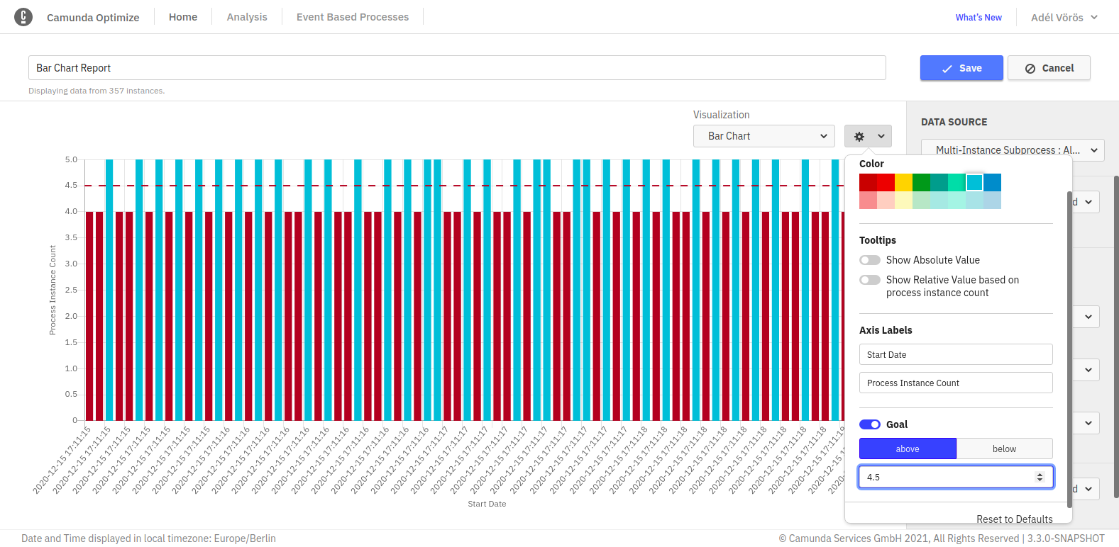
This feature can be also used with every other bar chart and line chart visualization. Here is another example where the target value is used with line chart visualization:
Custom Bucket Size for Date Variables
When evaluating a Report which is grouped by a date variable and displayed as a chart, Optimize offers you the option to select your preferred unit specifying the custom result bucket size in the Report configuration menu. The avaiblable units are year, month, week, day and automatic. The default unit is automatic, which will create evenly spaced result buckets based on the values of the date variable. This configuration option is also available for tables.
Custom Bucket Size and Baseline
When evaluating a Report which is grouped by duration or a number variable, Optimize offers you the option to specify your preferred result bucket size as well as a custom baseline in the Report configuration menu. The bucket size determines the width of one bucket, and the baseline specifies the start of the first bucket.
For example, say a Report contains the variable values 0.3, 6 and 13 and you set a bucket size of 5. By default, Optimize would now return a bucket for the values 0.3 to 5.3, one for 5.3 to 10.3 and one for 10.3 to 15.3. You may prefer your bucket start and end points to be a round number, in which case you should set your baseline to 0. With a baseline of 0 and bucket size 5, the result buckets now span 0 to 5, 5 to 10 and 10 to 15.
If these configuration fields are not set, Optimize will by default create evenly spaced result buckets with a range based on the minimum and maximum values of the number variable.
This configuration option is also available for tables.
Heatmaps
When enabling absolute or relative values switches, all tooltips for all flow nodes stay visible. This is also possible when you have defined target values. If you save the Report in this state, the tooltips will also be shown on any Dashboard this Report is added to.
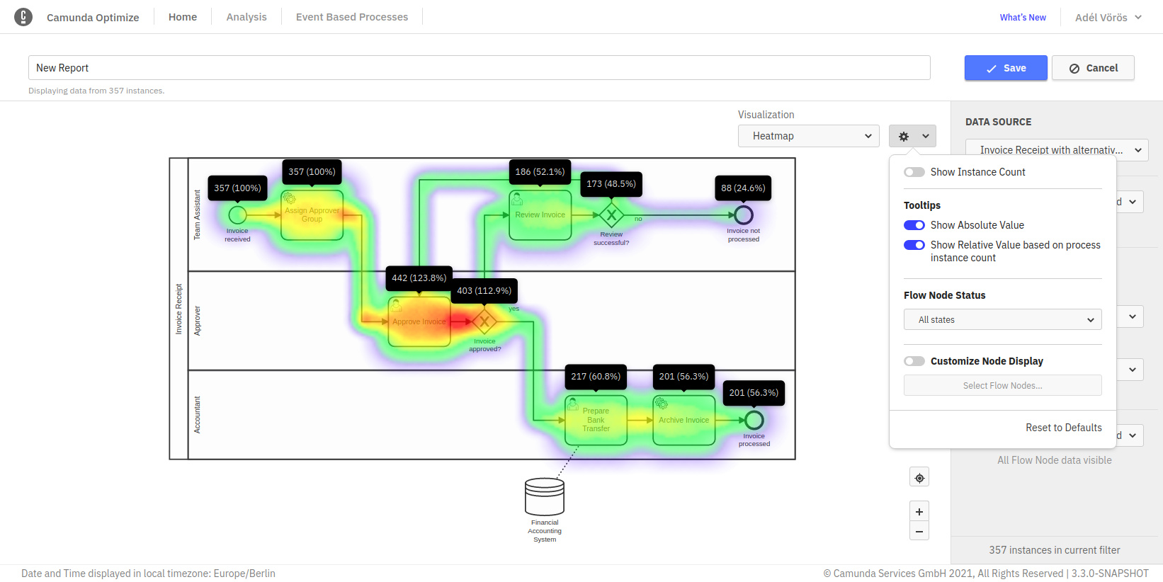
As for charts and table Reports it is possible to display the total instance count on the right-hand side of the visualization. If you save the Report while this option is enabled, the number will also be shown on any Dashboard this Report is added to and when the Report is shared.
Flow Node Reports
For all Reports that are grouped by flow nodes, there are additional configuration options available:
Flow Nodes included in the result
By default, all flow nodes are included in the result. If you have a user task Report, all user tasks of the process are present in the result. Especially for large processes, this could result in a lot of table rows or chart entries. In order to focus the Report on the important nodes, you can specify which nodes are included in the result.
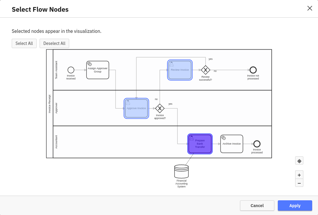
To do so, enable the “Customize Node Display” switch in the configuration overlay and click “Select Flow Nodes…”. This opens a window where you can select the nodes in the process diagram. You can also de- or re-select all nodes using the buttons above the diagram. Elements that cannot be selected are displayed in gray.
Flow Node Status
Some flow nodes can take some time to complete, e.g. user tasks or long running service tasks. By default, a Report includes all flow nodes in the calculations, whether they are currently running, canceled or already completed. You can change this behavior with the Flow Node Status selection.
By using the Running option, your Report will only collect information from flow nodes that are currently running. If you select the Completed option, only completed flow nodes are considered. Likewise, using the Canceled option will only consider flow nodes that have been canceled.
Distributed Flow Node Reports
It is possible to extend Flow Node Reports by distributing the result by Flow Node names.
To apply this functionality to your Flow Node Report, select Flow Node in the Distributed by section of the report builder.
Please note that this is only available for Flow Node Reports that are not already grouped by Flow Node.
User Task Reports
For all Reports with User Task view, the following configuration option is available:
Distributed User Task Reports
It is possible to extend User Task Reports to see which User Task of the Process your users/group are working on or have completed in the past.
To apply this functionality to your User Task Report, you can use the Distributed by selection in the report builder.
For example, if your Report is grouped by Assignee/Candidate Group, it is possible to distribute it by User Task as shown.
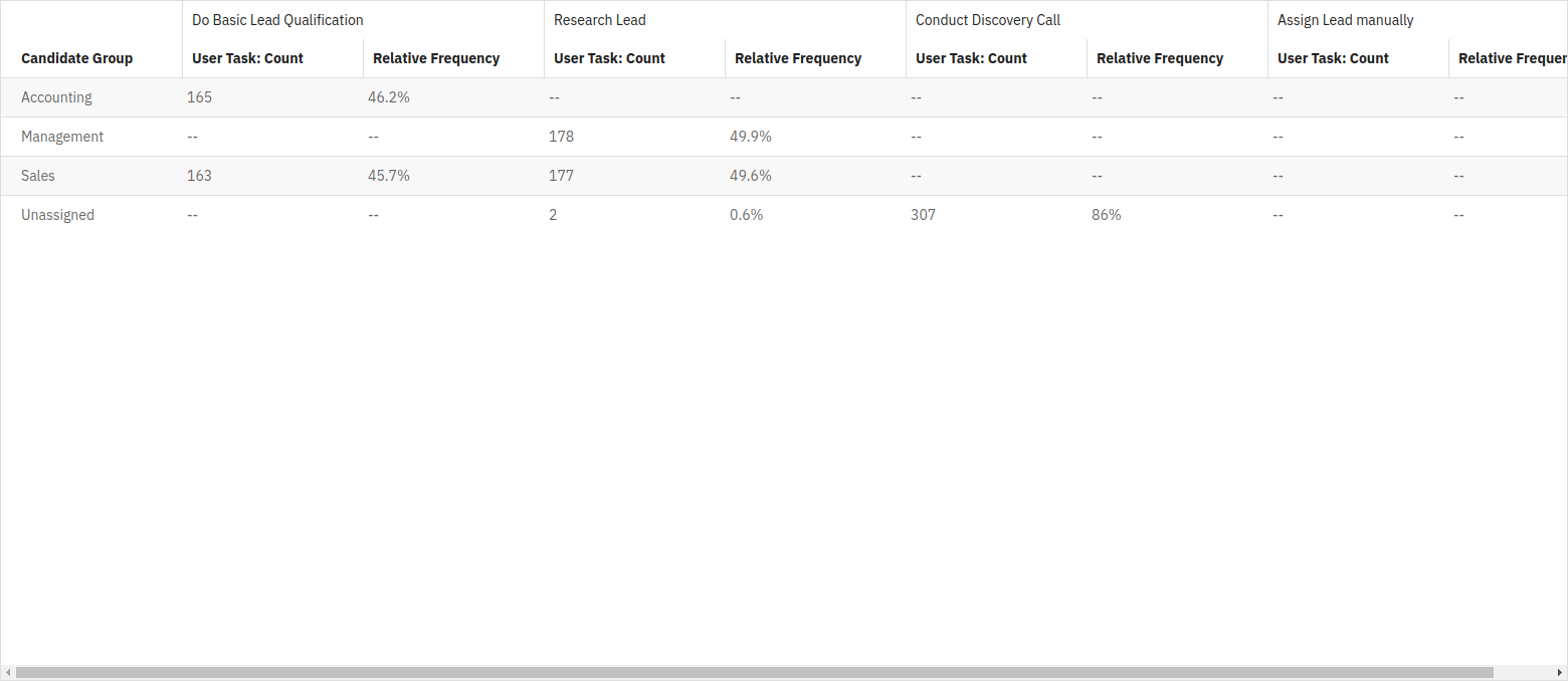
Please refer to the below table for an overview of all Distributed by options for User Task Reports:
| View | Group By | Distributed By |
| User Task Count, Duration | User Tasks | Assignee, Candidate Group |
| User Task Count, Duration | Start Date, End Date | Assignee, Candidate Group, User Tasks |
| User Task Count, Duration | Assignee, Candidate Group | User Tasks |
| User Task Count | Duration | User Tasks |
Distributed Process Instance Reports
Sometimes, it is necessary to add a second grouping to your process instance visualization. You can achieve that by using the distributed by option available in the report builder.
After applying a distribution to your instance Report, the count/duration will be grouped based on both the Group by and the Distributed by options.
The diagram below shows a Report grouped by Start Date and distributed by a boolean variable:
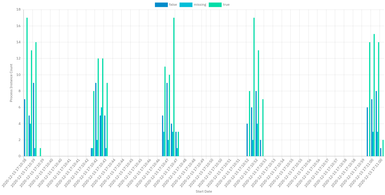
Here are the possible distribution options on process instance count and duration Reports:
| View | Group By | Distributed By |
| Process Instance Count, Duration | Start Date, End Date | Variable |
| Process Instance Count, Duration | Variable | Start Date, End Date |
View Mode
Once you have defined what your Report should look like, the view mode provides you with different kinds of actions, such as switching to the edit mode by clicking on the edit button or deleting the whole Report if you do not have any use for it anymore. If you want to see more details about the Report, you can interact with it, e.g. by moving your mouse over individual datapoints in diagrams or zooming in or out of heatmaps. The kind of interaction always depends on the Report itself.
In case you want to share the Report with other people or want to embed it in a webpage, you can use the sharing feature of the Report. Just click on the share button, which opens up a popover. After enabling the “enable sharing” switch, a link is generated which you can send to people who do not have access to Camunda Optimize and thus enable them to see the Report.
You can also use the “Embed Link” button if you wish to insert the report into your webpage. Everyone that views the webpage can then see content of the Report. The shared versions of the Report allow to view the Report itself only. There is no possibility to alter it or interact with any other features of Optimize. You can revoke the sharing any time by disabling the share switch.
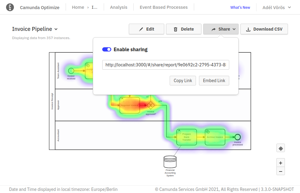
In case you want to download the data of the Report, you can click the Download CSV button shown above. The downloaded file will include the Report information in a table format.