Report
Reports provide you with the ability to view your data from different angles and thus capture all aspects that influence your process, show new trends or depict your current business state.
Each report consists of the edit mode and the view mode to perform different kinds of actions on it.
Edit Mode
The edit mode allows you to configure the report and adjust it to your needs. Therefore, you can perform all kinds of changing operations such as
- rename your report
- build a report
- save the current state with your applied changes
- cancel changes you already applied to the report
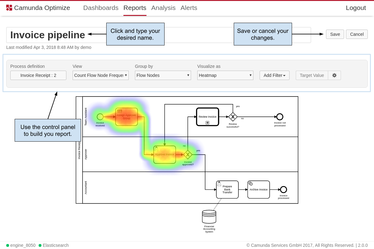
Building a report is the crux of the report edit mode. The building process itself is composed of several steps, which happen in the control panel.
Select a Process Definition
Every report relates to a specific process definition and version. You always need to choose a process definition you want to create a report for. If you open the process definition popover, you see two select items displayed. On the left one you can choose the process defintion name and on the right item the version. Independent from all other configuration options you can always adjust the process defintion.
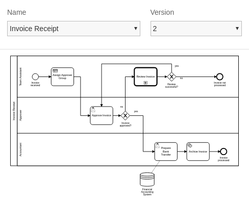
There is one particular option in the version selection, which is called all. This option is available for every definition and indicates that you create a report which uses data across all versions of the report. The latest version of the definition is the reference point, which means that data from older version is mapped to the most recent version. Therfore, the report data can seem to be inconsistent, which is due to changes that occured within the diagram throught the different versions, e.g. old version do not contain newly added tasks or a part of the diagram was removed because it was considered to be obsolete.
By default, all process instances for the selected process definition are included in a report. You can reduce this set of process instances by appying a filter. Read more about filters in the Filter section
Define the Report
In this section of the report builder you are characterizing the output of the report. Basically, you writing the following “I want to view … grouped by … visualized as …”. To understand better what view and group by mean, you can use the analogy of a graph, where view is the y-axis and group by is the x-axis. First you need to select, which part of the data you want to view. Optimize enables you to perform the view part in five different ways:
- Raw Data: View just a table with the actual data listed as rows. This can come in handy if you found interesting insights in certains process instances and need detailed information about those instances or you are exploring a process definition with a limited number of instances. The maximum number of rows shown in the table is limited to 1000.
- Count Process Instance Frequency: View how many process instances were started.
- Count Flow Node Frequency: View how often the flow nodes (e.g. tasks, gateways, etc.) have been executed.
- Average Process Instance Duration: View how long the process instances took in average until they finished.
- Average Flow Node Duration: View how long each flow node (e.g. task, gateway, etc.) took in average for executions.
Subsequently, you need to define how to group the data. Think of it as applying a metric to your input, where you break out your data by date or flow nodes. Essentially, you have three different options:
- None: Don’t split up the data by any means and just use the total number.
- Flow Nodes: Cluster the data by flow nodes.
- Start Date of the Process Instance: Group process instances together that were started during the same date period or time, e.g. hour, day or month.
Finally, you just need to define how you want the data to be visualized. Examples are heatmap, table, bar or area chart.
Throughout the definition of the report it might be hard to find out which combinations are valid. For this reason you get assisted during the building process such that only those configuration options are enabled that might lead to a result. For instance, if you choose Count Flow Node Frequency as view, the data is automatically grouped by Flow Nodes as no other combination would be valid. All possible combinations can also be found in the following table:
| View | Group By | Visualize as |
| Raw Data | None | Table |
| Count Process Instance Frequency | None | Number |
| Count Process Instance Frequency | Start Date of Process Instance | Table, Bar, Area, Pie |
| Count Flow Node Frequency | Flow Nodes | Table, Bar, Area, Pie, Heatmap |
| Average Process Instance Duration | None | Number |
| Average Process Instance Duration | Start Date of Process Instance | Table, Bar, Area, Pie |
| Average Flow Node Duration | Flow Nodes | Table, Bar, Area, Pie, Heatmap |
Target Value Comparison
Based on flow node duration heatmaps, Optimize allows you to specify a target value for every activity. For example, if a user task has to be completed within one day, you can set the target value to one day. If the average time it takes to complete the user task exceeds this target value, the task is highlighted in the heatmap.
To set target values and create a target value comparison heatmap, you need to be in the edit mode of a report which has the following configuration:
| View | Average Flow Node Duration |
| Group by | Flow Nodes |
| Visualize as | Heatmap |
If your report has this configuration, the target value button is enabled. Clicking on the Target Value button for the first time opens an overlay containing the process diagram and a table with all flow nodes. You can also see the actual duration value for every flow node. If you want to set a target value for a flow node, use the number and unit fields in the last column. If the target value number field for a flow node is empty, this flow node has no target value set (the selected time unit is ignored in that case).
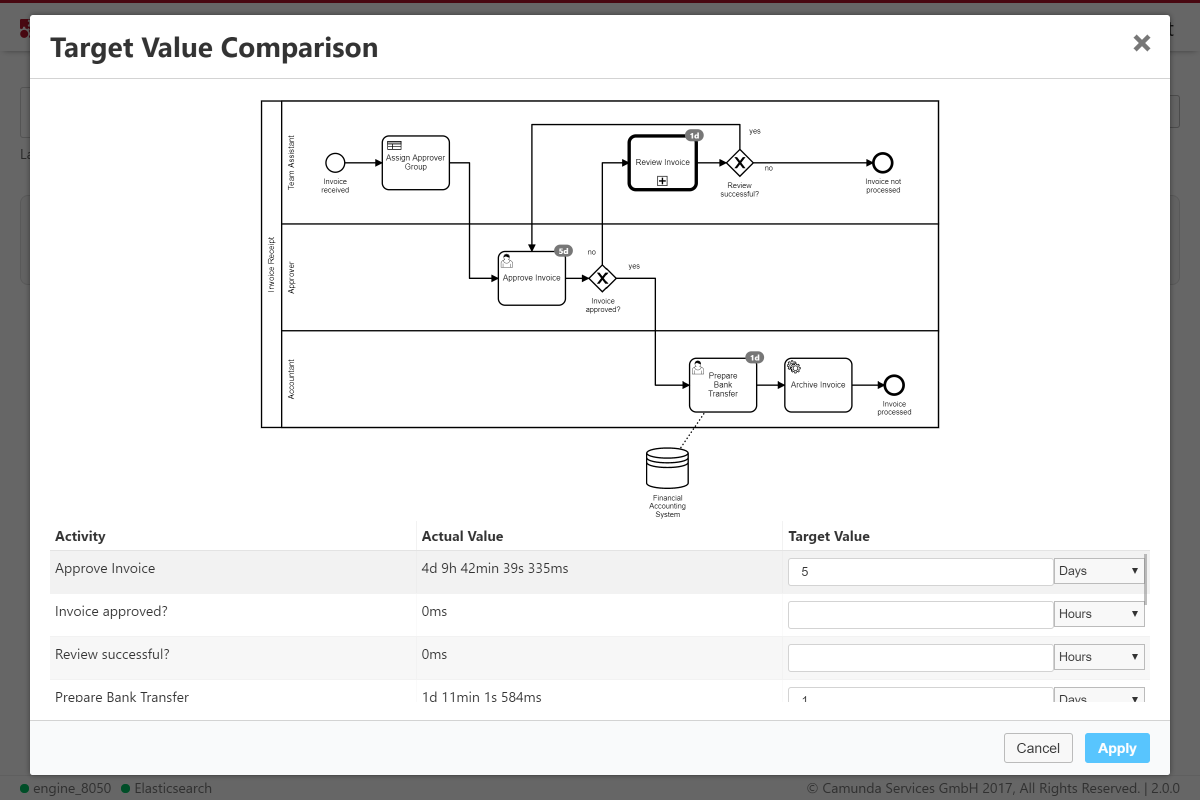
If you set a target value for a flow node, this target value is represented as a badge on the flow node in the diagram in the upper part of the overlay. You can click on any flow node in the diagram to jump to the target value input field in the table. When selecting a target value input field in the table, the corresponding diagram element is highlighted. To save the target value configuration, click the Apply button.
If you saved the target values, the normal duration heatmap is replaced with a target value visualization. In this new visualization, flow nodes with an average duration larger than the specified target value are highlighted in red. If you mouse over one of the nodes the tooltip shows the target duration value, the actual duration and the relative percentage the actual value is of the target value. You can also see the target value as a badge on the diagram.
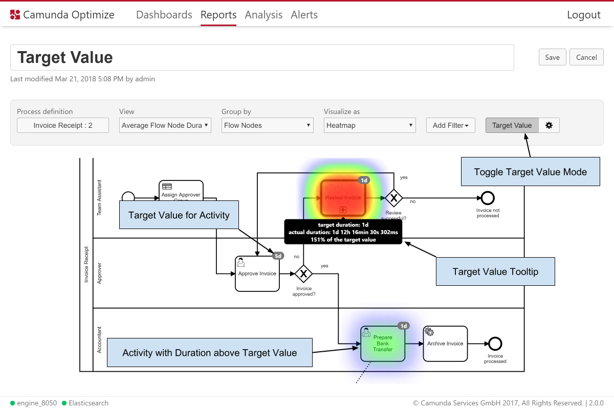
After the initial target values for a report are set, you can use the Target Value button to toggle between the Target Value and the regular Duration view mode. If you want to change target values, you can use the gear button to open the overlay again.
As with any change to a report configuration, in order to persist target values and show them in the Report view mode and on Dashboards, you need to save the report using the Save button in the upper right corner.
View Mode
Once you have defined how your report should look like, the view mode provides you with different kinds of actions, such as switch to the edit mode by clicking on the edit button or delete the whole report, if you do not have any use for it anymore. If you want to see more details about the report, you can interact with it. The kind of interaction always depends on the report itself, but the following shows some examplary actions:
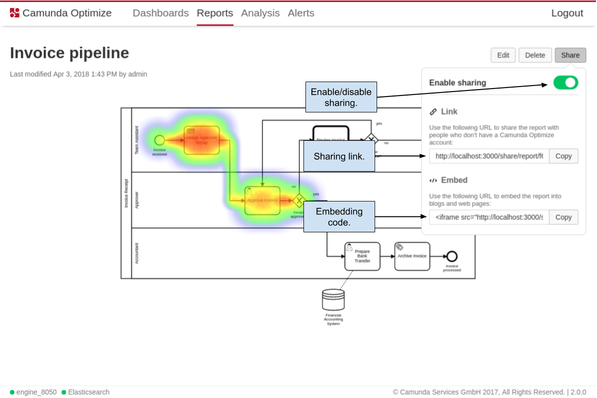
In case you want to share the report with other people or want to embed it in a webpage, you can use the sharing feature of the report. Just click on the share button, which opens up a pop over. You can enable the sharing by pressing the switch. Now, you can send the link to people who do not have access to Camunda Optimize and thus enable them to see the report. Also you can use the provided code in the embed section of the sharing popover and paste it into your webpage. Everyone that views the webpage can then see content of the report. The shared versions of the report allow to view the report itself only. There is no possibility to alter it or perform other actions that might abuse Optimize. You can revoke the sharing anytime by disabling the share switch.
